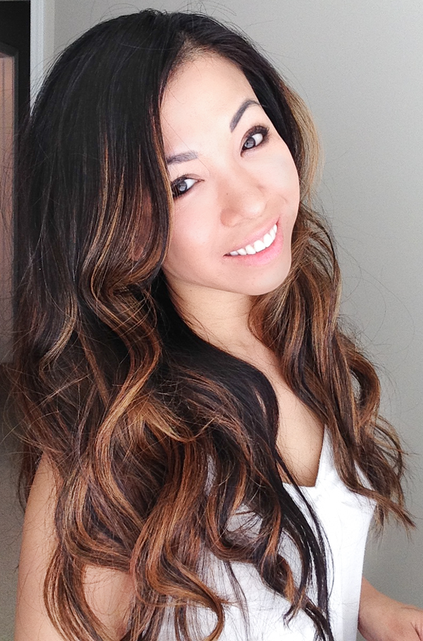
Remember the scene in Sex and the City the movie when Louise from St. Louis gives Carrie her Love charm? That’s Melissa Diep. She’s in love with Love. She’s the kind of gal who wears her heart on her sleeve and cries a little when her brides and grooms take their First Look. She loves the thrill of photographing the magic that exists between her couples, the innocence of a sleeping newborn, and the simplicity of a family in their own backyard.
Melissa is always on the hunt for the new and interesting in her hometown of Chicago, by way of Saigon, Vietnam. It is because of her family’s hardships and tenacity during their flight from the communist North––spending 10 days on a cramped fishing boat, then living in a refugee camp in Thailand for nearly two years––that have shaped who Melissa is today as a woman, wife, mother and photographer.
Armed with only a handful of pictures from her early childhood––one single baby photo and just a few as an infant in her family’s camp––it’s easy to understand why Melissa employs a photojournalistic approach behind the lens. She aims to deliver photo memories with stunning visual impact; natural and unscripted while telling your story effortlessly.
Melissa’s upbringing motivates her to live fully and to appreciate the grand, the small, and the in between. In her everyday, Melissa rocks girly dresses with blazers on photo shoots and drinks Vietnamese coffee. She believes in finding beauty in unexpected places, always doing her hair and lusting over shiny red Minis (regrettably, but dutifully, she upgraded hers to a more baby-friendly vehicle).
Melissa lives in Chicago with The Giant and Little G, also affectionately known as her husband and one year old son, of whom she religiously takes one 100 photos a day.


It IS a tough call. I have to say #2 takes the cake for me.
#1 of course!!!
I vote for photo#2.
i’m gonna have to vote for myself (picture #2), and take the moment to say that i made a blog post showing how i lit the shot on my blog at
http://metatim.blogspot.com/2010/03/red-label.html
i vote for #2. I really like the lighting.
#1 she rocks.
Number 2 is awesome!
I vote number 1 pic
I vote for #1 because she’s my sister! And she’s so pretty!
I vote for the first picture
#1 gets my vote
definitely number 2! great color, sexy, sharp, crisp. hot!!!!
#1
#2 wins for me
I vote for #2
#2 is the best…for sure.
#2
#2, fabulous lighting.
Number 2!
Def voting for # 2
#2 is the bomb!!! Can I buy this pic? Nice job!
I vote for #2! very awesome.. the lighting is great!
I vote #2 gotta love the red label!
Photo #2!
love RED LABEL
Photo #2 is amazing…love the dramatic lighting!
#1 is #1!
Definitely #2, excellent lighting.
I like # 3 folks
Photo #2!!! I’m Indian so I have to vote for the Johnny Walker Red.
#3
TIM LEWIS!!!!!!!!!!!! number 2 😀
#2 it is.
#2 was the best in my opinion.
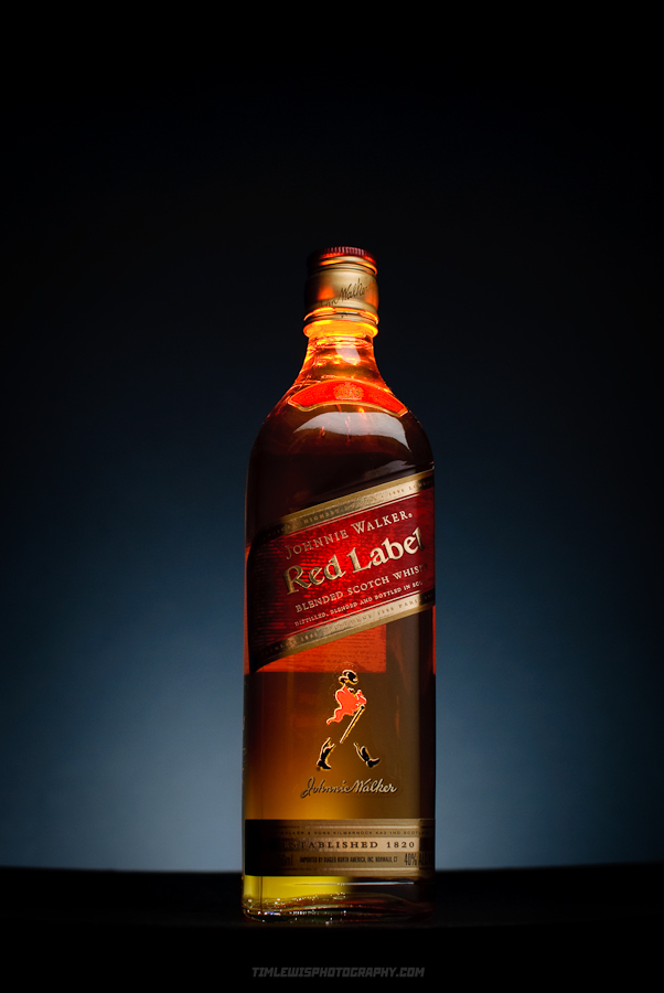
#2 makes the bottle look lit with warm light from within… very nice.
#2 is still awesome
#3 wins for me
I really like the way the lighting is done on #2. #1 was good too, but I think #2 is best.
I vote for #1 a million times if I could….
I vote for #1. 🙂
Number One is #1.
Definitely I am voting for #1!! Awesome pic!
I loooooove #1!
What beautiful pictures. I have to vote for #2. Clear, crisp, beautiful lighting.
#2! Nice lighting and on black glass too!
number 1 for sure!!!!!!!!!!!!!!!!!!!!!!!!!!!!!!!!!!!!!!!!!!!!!
#1 is definitely the best.
I am still smitten by #2
TWO
i vote for #2!!
Love the lighting on #2. That’s my vote!
#1 rocks!
Yay for #2!
#2 by far!!! excellent photo!!!!
#2 is absolutely fantastic. Brilliant lighting. Especially love how the top of the bottle looks like it’s on fire.
I vote for #1. Besides being a super gorgeous model, she is an excellent photographer, too.
#2
#1
Number 2 rocks
Hi Melissa,
My vote is for #1 – WOW, what a shot!
I vote for #1
even though I like the other images too, #1 gets my vote
#1 has my Vote
#1
I VOTE FOR #1
I love the mood on the first image.
#1 is my winner
#1 is so hot and she is my teacher. I vote for her.
#1!
no 1 is clearly the best and most creative image..sexy in a noir way
#1 has the most attention to detail and artfulness about it. It also tells a story where I feel the other may not to most viewers.
My vote, #1 !!!
#1
Good use of contrast and excellent use of depth of field. I choose #1.
Although all three photos are very nice, #1 definitely seems the most compelling to me.
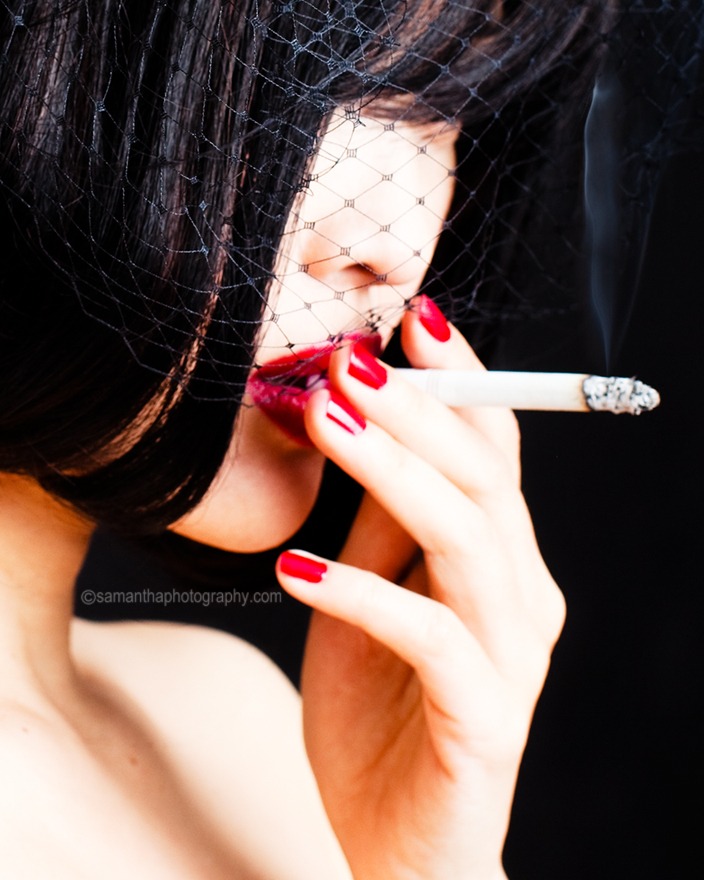
#1 gets my vote! That mysterious woman looks like she’s plotting something wicked… great emotional appeal. Nice subtle wisp of smoke – very tricky self portrait!
My vote is for #1 !!
My vote is #1 which is definitely a winner !
my vote goes for #1.
love the high contrast and the mystery the model projects.
#1 for sure!
My vote is for #1 !!!
#1 of course!!!
#1 is a masterpiece. it gets my vote.
#1
#1. So vogue! Shows talent!!!
The first picture is outstanding! Love it! Vote for it, no hesitation 😉
#2
Both look great, but #1 is obviously more creative, so it gets my vote. It’s not only a good looking pic, it also seems to tell a story.
I vote for #1. It’s so obvious!!!!!
#1 The most creative, talented, beautiful … :))
Number 1 (#1) is my favorite and my vote.
amazing ‘feel’ to it, so……retro
#1 for Number One!
Great work, Samantha!
I vote for #1
thank you!
Definitely #1.
It’s all about #1 here. The composition and the balance of crisp and depth of field keeps my eye wanting more. Look at how the curve of her bangs is juuuuust enough to cover her eyes. Beautiful.
#1
#1 gets my vote
#1
#1…it’s smokin hot…
#1
#1 is really amazing
WOW! #1
number 2 has such perfect lighting!
#1 for sure, the capture of detail with the net and the smoke is amazing. The shot makes you think.
I vote for #1! Definitely the best of the three…
Love the 1930s-1950s feel to photo number 1…reminds me of Humphrey Bogart films. Number 1 is definitely my favorite!
#1 Hands down!
no questions- #1 is the best photo, no offense to the other pics- they are good also. But #1 is my favorite.
i vote for number 2.
#1. Went to school with this talented lady. She’s awesome!
#1 us an awesome picture
Tim Lewis #2 AWESOME!!
I pick NUMBER ONE for sure. very clear and captures a mood.
Number 2!!!!!
#1 hands down!
Totally #2. It’s got the best lighting by far!
#2 amazing lighting
Definitely #1. Sexy, mysterious!
I vote for #2. . . expertly lit!
Sexy #1 is the winner!
Oh, wow! #2 is amazing! I love it! Good luck!
#2 hands down. Classy, sexy, … what else is there?
#1 is stunning!
#2 awesome!
#2 is crisp and the glow of the bottle is impressive
# 2 Awesomeness!
I like #2 the most.
I vote for #1 because it’s sexy hot!
Color and lighting combo of #2 is fantastic. I have been interested in photography for a long time and the skill of the photographer who took photo #2 is just superb.
#2 Amazing Lighting!!!
I vote for #1 all the way.
#2 😀 GO TIM GO!
The lighting and quality of #2 is something seen so rarely nowadays. #2 is wonderful!
#2 is amazing!
My vote is on #2!
#1 gets my vote The lighting is great and there is that touch of
a 50’s movie that I like
#2 is the best
#2 wow! Lighting superb!
I like Number 2
i like # 2
definitely #2 – don’t like the alcohol but I love the picture!
#1 The girl with cigarette wins it for me
NUMBER 2!!
Gotta say #2 is something!
Lewis, Lewis, Lewis #2
#2!
number two
2
#2
Definitely #2
#2, the lighting is exquisite warming the liquid within, inviting me to place a generous portion to my lips, tasting it’s smoothness as it passes over my excited taste buds then slides smoothly down my throat, warming my entire body. Dang now I want some Johnnie Walker….
#2 – Stunning yet smooth. Warms the soul.
Number 1. The smoke is tantalizing. Amazing that the photographer is the model. so difficult to do. very artistic.
#2 quite warming
#2 great job at lighting!
Love the colors and lighting in #2.
#2
#2
#2, the lighting is really cool.
I vote for #1. Not only is the photograph great, but the model is smokin’!
Red nails, red lips, and a red hot model all in a well composed photo – perfect.
#! #1 #1 #1 #1!
#2 Go Tim.
#2 baby!!!
#1! You can almost taste the smoke! This picture makes you feel like you are in the same room with her. I like the contrast of the pale hands next to the brillant red lip stick and nail polish, as well as the pure skin next to the black background. The colors that were used were key into making this picture a success. This picture just invites you in.
#2 is awesome!
#1
2 is my fav
#2. Great lighting! I’m thirsty…
still the biggest Fan of #2…
#2 has the perfect shade of red. Beautiful.
i’m still in love with number two.
mmmm-#2
delicious, delicious number two
my vote is for #2.
voting for number two.
I vote with confidence and enthusiasm for #2: Tim Lewis. Nice work!
Totally #2
#2
#2 has good composition and use of light.
Number two. It showcases the best photographic skills.
#2!
Lovin’ #2
#2 is beautifully lit
#2 impressed with the detail and care to create the overall effect of the bottle. There is a “life” feel to this inanimate object.
#2 Es muy claro!
#2 is a shot taken with care, a bottle that has been made soft, warm, and feeling. This is impressive because now it is no longer “just” a bottle.
#2 has such cool lighting I can’t stop looking at it.
#2
#2 is awesome!
#2 gives a warm glow that makes it seems like you’re already consuming the alcohol…mmmmmmmmmmm =) yay for #2!
vote 2
# 2
Gotta go with #2
#1 is pure class and style
I vote for #1. Very original.
Vote early, vote often. #1!
#1 for the WIN!!!
#1 – Sam rocks 🙂
#1 for the win indeed….
OFF COURSE #1!!! No Doubt about it!!
#1 is the winner for sure!
#1
#2! a million times #2!
I like #1!
#2 is it! =)
number 1 is my vote and by far the best.
#1 for me.
very nice concept and well-executed!!
i’m voting for number #2
#1 is amazing… the focus and contrast is great and the red adds just the right amount of color to make the picture really pop and standout.
#1 of course!
Number one is the best, no contest
#1 Love the veil!
casting my vote for number 2
#1 of course!
#1
#1
#1!
#1 its an amazing shot.
I vote for no. #1 as it is a wonderful portrait of a great young woman.
Number 1, all the way
#1 is the clear winner
#1 rocks!!
No. #1 – beautiful
#1 is my choice
#1 is the most original shot, gorgeous!
TWO. Number TWO is the best!
#1 is far more original
I’ll have a #1 with a coke please. photo number one is the best.
number TWO gets my vote
#2…hands down the best, plus i just really don’t find smoking sexy…
#1 ROCKS, plus I don’t find alcohol very sexy…
#2!!
My vote is for #1!
I vote for §1, which is very creative. The other two are very good too, but I really prefer the §1.
I VOTE FOR #1…IT’S HOT..HOT HOT!!! I LOVE THE RED LIPS
#2 in high def!!!!
give me to #2!!!
#2! for sure!
#1 all the way!
Ahhh yeah!!! #2. Rock on!
The light makes me think of crystal
Oops. That is: The light of #2 makes me think of crystal
#1 is amazing!!!
#1
Number 2! best lighting, best composition, best photo. no doubt, number 2!
#1 rocks
Definitely, #1. That photo rocks!!!
#1 all the way!!
#1, no question about it
#1 for sure. there is a story told in this picture.
#1
#1 is beautiful
#2. Absolutely Fabulous.
The lighting…the colours…the mood…the smoke…the composition…#1…
Simply gorgeous!
#1 the photography is awesome and it tells a story and makes the observer think.
# 1… it is simply a classic Image.
#1
#1 gets my vote!
#1 gets my vote!
#1, no question! Excellent photo
#1 hands down.
#1 For me!
I vote for #1. It’s the best one!
#1
#1. Sam is stunning and her photography skill are exceptional
#1 wonderful image..
there is only one # 1, and that is #1
#1, absolutely
1 is gorgeous
#1
# 1 for sure!!! Composition & coloures & postproduction is the best!
#1 is the winning shot!
thanks everyone for voting for me. I have the classiest group of friends I swear…you know how to vote with such grace and etiquette:)
I of course will be voting for #1 🙂
Definately #1!
AWESOME!
#1 for sure!
I vote #1 great shots all of you!
No 1, no doubt
#1 is my fav. Good Job! Good luck!
#1
#2 is great
They’re all good – but #2 is exceptional
I vote for image #1
i’m voting for #2
#1
#1!!! superfly
I’m voting for #1
#1 is my favorite!
# 1 Is my favorite!!!
#2, the lighting is superb
#2 hands down. great lighting and color!
i vote #2. great ambient lighting… exceptional photo.
#1
#2 hands down. great lighting and color! love it.
I vote for #1.
#1 for sure!!! Best one out of the three no question!!
#1 is perfection!
I vote for #1 because it’s remarkable!!
#1 is the best with the color contrast!
Vote goes to #1
DEFINATELY #1! Gorgeous!
i vote for # 1
I vote for #1!
#2!!
Voteing for number 1!
I like #2 the best. I love still-lifes! Good lighting! 🙂
#1
They are all excellent, but I think I have to go with #1…
Number 1 Sam rocks
#1
#1
it’s the best one !!
#1 of course
#2 is awesome!
i vote for #1
#1 for deliriously alluring reds.
#1 is my choice
#1 great image!!!!!!!!!
#1
is
#1
#1 should win this contest!
#1 #1 #1
I like #1
#1 clear winner. It engages with me. doesn’t look like commercial image.
#2 is sexy. I love the graduation of the blue background and the glass against it.
The focus is great
The focus on #2 is great
Definitely #2!
#1 is perfectly shot! love the detail of the smoke and the backround of lights, looks like a cover magazine shot here!
#1, a super bridge between classic and contemporary
#1 is my fav – the composition, the focus, the atmosphere, all accented by the color red. Mystery, intrigue, and pretty sexy, too. Gotta love #1!
#1!!!
#1 This photo is fantastic,and so is her other work. Choose #1!
I vote for #1, it’s very creative.
Definitely #1 always
#1 She is so beautiful!!
Definitely #1 is the most beautiful image.
#1!!! (still 4/11 in Hawaii)
#1 for me please!!!
If voting is still open, I vote for #1!
I LOVE #1!
1# for sure! sultry as!
#1 🙂
#1 wins cut the check!!!
#1 😀 Couldn’t have picked a better number for this piece of art 😉
#1
One I would say!
# 1 of course.
# 2 Tim Lewis
#2
# 1 is my winner!
#2 Tim Lewis
#2 rocks!!!
#2 is the best!
I vote for the #1 ! master piece